27 July 2014

Signed, sealed & delivered


Countless cubes and months later, my title for BookArtObject Edition #4, Mise en place, has finally been designed, printed, scored, trimmed, folded, packaged up & sent into the world.

The process of creating a finished book from that first tiny seed of an idea is always quite an undertaking. I was grateful for the loose deadline afforded by BAO; though I feel I somewhat abused it, the piece was able to take as long as it needed to find its natural conclusion.


I finished production of the BAO edition just before leaving for the US in early June, and decided I might as well send them from there since the recipients in my BAO group all live in North America. But I didn't actually manage to get them mailed until the day I flew back to Italytoo much going on, and too many people & places to see! Everyone should have received them by now, so here are some photos...


The image above shows what each artist in my group would have found once they loosened the kitchen string used to tie up the small package. (The wrapping is one of those papers encasing the odd orange here in Italy; these are always kind of special to find, so I collect them.) I also included a note written on a flat card printed with the pomegranate that appears on the first/largest little booklet-cube in the set. Via email each artist received instructions on how to assemble the accordion-folded booklets into a set of four gradated cubes ranging from 5x5x5 to 8x8x8 centimeters (just under 2" to a little over 3").

I am continuing to sort through the notes I kept during the project, so more on the process/evolution/method/mediaplus photos of the cubes assembled——yet to come...


17 July 2014

Violet in Seattle

A section of the wall in the EMP museum shop.


This month's edition of the ROY G BIV Challenge* was a lot of fun to photograph, and came together in a single afternoon during a recent visit to Seattle. After turning in the cute little Chevy Spark that had gotten us safely up the west coast of the US, we had a single night & day in Seattle before our red-eye to the east coast. Much of the morning disappeared in pursuit of sampling various downtown coffee shops, checking out the Pike Place Market and generally enjoying the city bustle before heading over to the Experience Music Project (EMP) museum.

While my daughter was there for the music aspect of the EMP——much of her time was spent in the practice rooms of the Sound Lab since she was missing her instruments by this point of our trip——I was especially looking forward to experiencing the architecture. And the fluid, multi-color metal surface and constantly changing reflections of the Frank Gehry-designed building did not disappoint. By the time we exited to a clear evening several hours later the center section had transformed into to more of a fuchsia color, but the effect was purple when we first entered under rain-threatening skies. Thus began my quest for VIOLET...

It wasn't hard to find. Just as the exterior of the building offered several glimpses of violet, so did the space within...lights & color joined and reflected on the metal panels that also line the interior. With its enormous screen, hi-tech sounds system and light effects, watching music videos in the Sky Church makes you feel like you could be at a concert (complete with lots of blue, red——& purple——lights; a few of the purple-y moments are shown below). In fact, I suppose you could say that (Psychedelic) Purple is pretty much ingrained in the spirit of rock 'n roll.


Umbrellas hang from the Sky Church's seventy-foot ceiling.

The sense of drama above this set of stairs (right) matched that of the Sky Church (left).
Intersecting ceiling panels/reflections
This ceiling/wall inside (left) could easily be confused with the building's exterior (right).
Another view of the intersecting ceiling elements


There is a general impression of letting go of a sense of time and place in this sculptural, ambiguous wonder of a building—a feeling that seems perfectly suited to the scope of the Experience Music Project. You can discover more about the EMP by following this link.

*


I still have some catch-up to do with everyone's explorations of June's ROY G BIVI can never seem to manage much time on the computer while traveling——but am excited to see both the INDIGO and VIOLET discoveries. Also, I am sorry to not have replied yet to those of you who kindly took the time to leave comments on my quick "indigo" entry, but I look forward to reading them properly and finally answering il prima possibile.

*


The ROY G BIV photo challenge was created by artists Jennifer Coyne
Qudeen & Julie Booth. Each month is devoted to a different color of
the rainbowred, orange, yellow, green, blue, indigo & violetand
all are welcome to join in the search. (Guidelines are here.)

23 June 2014

Indigo, from Florence to the USA


I am on the road at the moment—driving up the western coast of the US with my daughterso a little late with my "indigo" contribution for ROY G BIV this month. On the left is my sequin-filled, indigo-inspired box for ALaW (the unassembled sleeve can be seen in my previous post), and the image on the right is a shot of the gorgeous (chilly!) water surrounding Pebble Beach.

Happy summer to everyone in the northern hemisphere!


31 May 2014

Letter-happy


I have really been enjoying my first alphabet for this year's edition of A Letter a Week—aka ALaWproject. In case you missed it and are wondering how these letter-inspired designs came to be, my initial post explaining the link between the non-letter-looking designs & the shapes we traditionally associate with the alphabet can be found here.

The "letters" are now all designed & printed, but will likely have to await assembly until my return from our upcoming summer adventure, which looms almost too soon! At the moment the studio is full cubes as I finish up my Mise en place edition, as well as other items inspired by my ALaW designs, plus calendar pages, etc., for people we'll be visiting.

The sleeves for the letters that I've already posted over the last few monthsassembled & complete with their boxesare shown in the first photo, above. Top to bottom/left to right:
V
B / O / G
Z / A / L / T
S / E / M

You'll probably notice that very few bear much resemblance to the letter their design is comprised of. In fact, the designs started to get a little too intricate & complex considering the 7x7-cm size called for by the ALaW guidelines (though I find they lend themselves well to other ideas). Some I feel are more successful than others, in terms of the composition & the colors, but I have learned from all of themnot to mention a lot more about working with Adobe Illustrator. I am continuing to explore the possibilities of the designs, and there have been nights lately when I could hardly sleep for the colors & patterns filling my head!

*


The rest of the photos show the printed strips for the other fifteen letters, with cutting & scoring marks and, in a few cases, some "overrun" of the designs (which will be trimmed). What you are seeing in each strip, from left is right, is: side 'A' of the sleeve / the top / side 'B' / the bottom / an additional "side" that will disappear when it's attached to side 'A'. Though the format for each "letter" is seven centimeters square, I opted to extend/wrap the design around to the sides and/or bottom of the sleeve for many of them.

The designs below are, top to bottom:
I / P / J
I love the 'P', to which I applied a "stamp" filter in Photoshop for one layer of the design. I was thinking of batik as I designed this one... I also really like the simplicity of the 'J', with the deep red imposed over the charcoal...it makes me think of seed pods/plant parts.


*


Next are, top to bottom:
F / U / C
(Sorry about the rude-sounding letters there—it was purely coincidental.) I quite like the contrast & simplicity of the two colors of the 'U', and would like to try the design in varying color combos. The 'C' was inspired by photos of my niece, Charlotte, when she went strawberry picking this spring.


*


Below are, top to bottom:
K / W / D
I love the 'W' & will be trying it in a few other colors too. Even though the design element you see actually looks like a 'W', in fact it is multiple 'W's' compressed, overlapping & layered. I like that the design in this case does evoke the letter of which it's made...


*


Here are, top to bottom:
R / X / N
I love the 'N'though all of the colors in this photo are a bit on the garish side here for some reason.


*


These are, top to bottom:
H / Q / Y
For 'Q' I was trying to create something with a "lacy" effect, and had to print it several times before there was enough contrast to make out the design (which includes a very subtle all-over background pattern as well...you may be able to see it better by double-clicking the image). I really love the purples & greens of the 'Y'.

*


So, that's ALaW alphabet #1. Next will be the "Place"-themed alphabet." I'm really looking forward to this one as well, and am using Italo Calvino's Le Città Invisibili (Invisible Cities) as a starting point.


15 May 2014

Watching the sky


Time for some "blue," May's ROY G BIV photo challenge color. I had hoped that the Arno would have changed to blue by now, but green was still the predominant hue when I last walked cross the river a few days ago. (You will find a couple of shots of the water later in the post, though they were taken earlier in the year.)

We have been waking up to the most beautiful, deep blue skies——the kind that make you grateful to be alive——so yesterday I decided to photograph the phases of the sky as the day progressed. Not a cloud could be seen when I awoke, but before the church bells had even chimed noon, fluffy white shapes began to invade the vast blueness. All in all, there was quite a bit of action in the sky, saving this post from being a series of homogenous blue swatches.

I've organized those I've chosen (from a selection of nearly 100!) according to either contrasts or similarities.

The first pair of images (above) shows the sky as I watched my daughter leave in the morning (left), and a blush of pink at the end of a tunnel clouds at sunset (right).


*


Below is a mid-morning blue & a late-afternoon blue (when the sky was almost colorless in proximity to the sun).


*


Fluffy white clouds that became gray as the afternoon went on...


*


A cloud surrounded by sky, and another one lost in a sea of gray...


*


Left: Trip planning along the Atlantic. Right: The pattern of clouds in this shot reminded me of the eastern seaboard of the United States. (The four- by three-foot map of the US that we bought last year has been on the kitchen wall until recently; as the school year screeches toward summer, it has become an interactive "tablecloth," for more hands-on planning.)


Sunshine trying to poke a hole in the clouds at 16:40, then painting the sky pink & violet just before calling it a day at 20:43...


Sunset-time, seen through one of our windows, as well as on the river (another day)...


Through the large arch of the Uffizi that overlooks the Arno is a slice of sky reflecting on the water. It reminded me of the map-view of a lake (and the building's mottled reflection makes me think of terrain shown on a map)...


*


Some twilight photos would have been the perfect way to end this post, but a veil of clouds hid the usual gradations of deep blue (the shades of blue that I love) before making way for the full moon a bit later. I don't have much success with nighttime photos, so it's probably best left in our imaginations!


*


The ROY G BIV photo challenge was started by artists Jennifer Coyne Qudeen
Julie Booth. Each month is devoted to a different color of the rainbow—red,
orange, yellow, green, blue, indigo & violet. All are welcome to join in
the search; June's color will be INDIGO. (Guidelines are here.)


11 May 2014

Lines of lilacs


Today is the day we celebrate "la festa della mamma"——Mother's Day——in Italy, so I'd like to send a wish to all of the women who so beautifully mother & nurture others, including my own creative, inspiring & loving mother, and my daughter, who has inherited the same qualities.

I also thought this would be a good chance to finally share an image of my lilac "story strips" from last spring (above, left & below). They were made from the Mother's Day lilacs my daughter had given me last year, which I wrote about in this post. Spring was all but over by the time I finally sorted through my photos of the rows of lilac buds/petals/clusters I had assembled, and it felt like the moment to post them had passed. Here are a few notes I had written at the time:


I wish I had created pages & pages of lilac story strips, but that won't be possible for another nine months or so. One thing is certain: lilacs do not overstay their welcome!
I conducted an experiment of sorts, to see if I could entice them into a lengthier visit by snipping the blooms from the woody stems and submerging them in a sink full of water. Not only did the tender, wilted flowers perk up but, almost completely submerged in tall clear glasses of water, they lasted for another several days (image above, right). I was surprised to see that the lilac color began to fade at one point, and eventually the tiny flowers became colorless (essentially white) before shriveling to pale brown.
The flowers that dried right on their stalks, on the other hand, turned a deep, almost-black purple, and have joined the tray of floral remnants left from each month's flower explorations. I find I am equally fascinated by what remains at the end of a flower's life as by the flower at its freshest.


And here's a glimpse of some of the Mother's Day treats I awoke to: a "bouquet" of chocolate-covered strawberries & blackberries, a pyramid of chocolate-mocha-pecan muffins, a heart-shaped cardboard Mother's Day card & a glass of fresh orange juice (enthusiastically drunk before I snapped the photo). My daughter also took the time to learn how to make coffee with my fun new espresso maker, which I will have to write about here one day——it's an objet d'art in its own right!).


Gather ye lilacs while ye may...


08 May 2014

Sydney Intro/Retro-spect(ive)


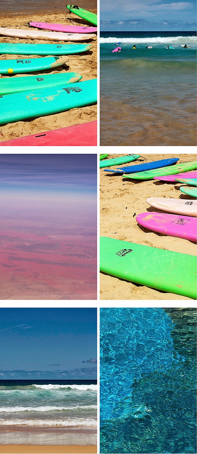
You may remember the above image from last Christmas's blog entry, when my daughter & I were in Sydney. I've been sitting with my photos from that trip all these months, returning periodically to sort, consider & arrange them. The majority of the pictures I took were mainly for the sake of recording our activities & adventures with my brother & his family (and my sister & hers when they joined us)as a way to preserve the memories of our time together. Somehow, on this very first visit to Australia, it felt more "right" to just take everything into get a feel for the place & not be distracted by trying to photograph the landscape, the water, the architecture & the thousands of details in between. The camera is a wonderful tool, with many uses, but I find it can also distract from the actual experiencing of places, of moments.

Not until the final days did I feel truly ready to take in my surroundings through the camera lens. Fungus-spotted stone & an eroded rockbed at the water's edge called to me at the end of a bush walk and ended up becoming a sort of framework for stringing together the earlier, fairly random, photos. And then the awesome view of that vast country, with its rich colors & patterns, was the ultimate glimmer of magic as we flew across it on our way home a couple of days later.

So, at long last, I thought I'd share a sampling of screenshots I'm using as a reference for a book structure I've been putting together...


*


*


Working with the photos from this adventure—even the non-family ones shown abovehas at times been difficult. They each hold the memory of moments not necessarily seen, but contained withinmemories which underline the distance between Italy & Australia, driving home the reality of just how far-flung my family is. (My daughter & I in Florence, my brother & his family in Sydney, my sister & hers in Beijing, and my parents on the east coast of the US for all but the few months they spend in Italy.) When I think about how much of my nephews' & niece's growing-up-years I have missed, I find myself wishing we could more easily be part of each other's daily lives... If anything, it makes me aware of just how precious the three-week stay with my brother's family was.

I do wonder if my parents realized what they'd started when they left their own families and brought their children to live in Brazil for five years! I'm sure it's what has given us each the freedom to feel we could choose to live any place that called out our names. And we are lucky to be able to meet in so many different & wonderful places whenever we have the chance.

*


My box of Sydney-found treasuresbark, leaves, berries, papers & things I have momentarily forgottenis still awaiting the right moment to be opened. I like the idea of putting some time between the discovery of the individual items & their collective unveiling, but I must admit that I am beginning to grow curious. And I wonder what additional memories will surface?

Related Posts Plugin for WordPress, Blogger...