15 June 2012

The rose garden in spring


The Giardino delle Rose is one of my favorite places in Florence, and even more so now that several sculptures by Jean-Michel Folon have been placed throughout the terraced rose garden overlooking the city. {The sculpture with the bronze man sitting on a bench (below) is called Je me souviens.}


Roses intoxicate

birds call
insects buzz

cameras focus
voices disperse

rooftops recede
sky looms

thoughts drift
senses awaken

time melts.


Sweeping like the view—floating across rooftops & reaching into the hills—Florence's church bells mark the quarter hours. One at a time, melodies from the many campanili come to life: tinny, clanging, sweet and undulating. Then those from the cathedral chime in, lower and deeper than the others, resonating, connecting three-hundred-and-sixty degrees of bellsong.

I'm not sure if it's the natural consequence of venturing beyond the city's boundaries, into a seemingly different world...of experiencing the change of pace and the shift of mindset that comes with it...but each time I visit the rose garden I can't help but fill my camera's memory chip with new photos. It's almost as though I'd never seen a rose before—or an artichoke, or a lavender bush or a head of cauliflower. (Maybe this is what happens when you no longer have a garden of your own?)

As much as I loved the many outdoors spaces and 'rooms' that encircled our old house in southern California, I don't really mind having to travel a little ways to arrive at the giardino delle rose. It is certainly more of an event, entailing a more conscious decision to leave the studio, forget the chores, delay the errands—things which can often be hard to otherwise do.

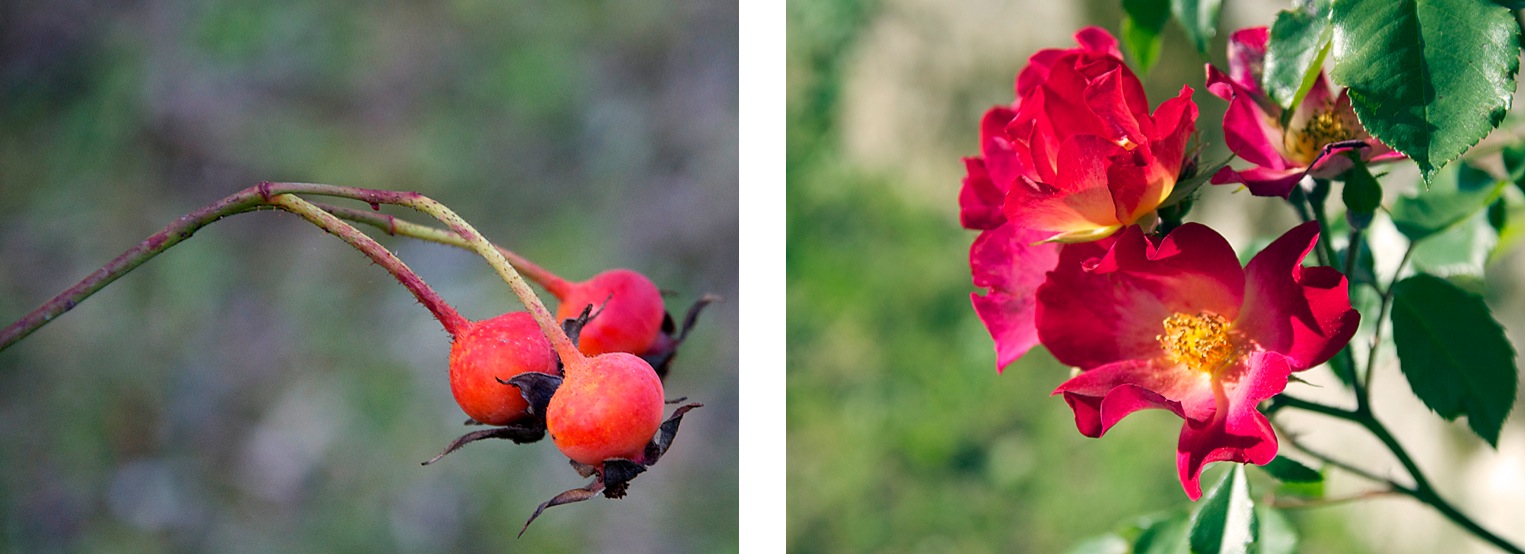
And what a pleasure it is to take home little 'pieces' of the garden, to sift through the photos afterwards. I have paired a handful of images from one January afternoon (first shown in an earlier Arzigogolare entry) with a selection taken during the course of several visits this past May. On the left of each set is the winter view, and glimpses of spring appear on the right.


Last year's rosehips have given way to this year's blossoms.


The striking fuchsia stems I discovered in January turned out to be green & leafy in spring.


I loved the glimpse of this one pomegranate, dried and split, caught in a nest of winter branches. The tree is so different in this season: new pomegranates are just beginning to form at the base of vibrant flowers that stand out among the shiny leaves.


At the beginning of the year, the pond reflected a steely sky; now that spring is in full swing, it reflects the new life in the garden. (The reflection of Mediterranée, another Folon sculpture, can be seen among those of the trees).


In January, a plethora of tiny rosehips decorated a web of stems; now, tightly closed buds await the right moment before blooming.


Artichokes that made it to winter turned fluffy and are barely recognizable as the sturdy multi-pointed stars that slowly unfold this spring.


Who knew that the harvest moons decorating these rose stems were the small fruits of pink roses?


A January cauliflower nestled among layers of leaves calls to mind the intricately layered petals of this freshly bloomed Rosa Donne d'Italia 150. The tri-color rose was created last year, when Italy was celebrating 150 years of unification, and dedicated in honor of the Festa delle Donne (International Women's Day).


Winter's festive screen of rosehips has been transformed into a verdant wall dotted with thousands of tiny roses just starting to bloom.


Those red thorny stems that caught my eye in January now bear blousy golden roses.


Bushes with red-tinged winter leaves & berries have turned green, with next winter's berries beginning to grow.


Translucent dried leaves capture light from January's low sun while spring's profusion of rose petals mimic shades of dawn.


* * *

Below are more images (all taken this past May).


What a difference a week can make: it didn't take long for potent round buds to blossom into flouncy peonies.


Books in the garden: [LEFT] The bronze man featured in Je me souviens (the Folon sculpture shown at the beginning of this post) holds a beautifully weathered book. [RIGHT] The pages of Gift from the Sea by Anne Morrow Lindbergh flutter in the breeze. (I loved how a sprig of mint picked from underfoot lent a hint of freshness to the tea I brought to the garden one afternoon.)


The rusty shades of a velvety iris are echoed by the patinaed Partir, another sculpture by Folon (above is a detail of the waves and the ship that rides upon it).


Some of the most delicate blossoms are my favorites: joining the scent of roses is the delicious fragrance of lemon blossoms. (A few lemons from last season still hang among the foliage, creating a splash of yellow mixed in with the pink buds, white flowers & rich green leaves.) The olive trees have been blooming with sprigs of miniature blossoms too, momentarily giving the trees a very different character.


"Carciofi!" I hear over and over. No one can resist exclaiming over the artichokes when they pass by the clusters of them—the roses they expect, but carciofi are another thing altogether. They're so magnificent, rising from their stalks like purplish-green rose blooms...


The most startling jolt of color in the whole garden must have been the Rosa Sericea Pteracantha. The color of fresh blood, the thorns edging these stems caught my eye as I was winding down to the lower entrance one evening. As spring passes, the thorns are losing their vibrancy, growing deeper in color.

* * *

And now, as I finally pull together these garden photos, it is already the middle of June—nearly summer! The intense perfume of tigli (linden trees) has filled the city during the last few weeks...especially delicious in the coolest hours that begin and end each day. Up at the garden, the peonies have long given up, and the roses are fading fast. I look forward to seeing what the camera will discover as the next season unfolds...


{A few of my notes about artist Jean-Michel Folon appear here. I also mentioned him on pages 125-127 in the Piazza della Signoria chapter of The Piazzas of Florence, and more Folon-inspired work is in progress.}

{For notes on my annual rose garden readings of AML's book, Gift from the Sea, please click here.}

{Follow this link for a lovely series of photos portraying the growing cycle of the Rosa Sericea Pteracantha.}

19 May 2012

Weaving & word play


This month's word would have to be 'weave'. As I began exploring the principals and elements of weaving for one of my recent projects, I noticed them winding their way through other aspects of my work. I just love how everything feeds off of each other; this is one of the joys of having lots of different projects going at once. The downside, of course, is that it takes longer to complete them. But, as I've noted before, I view time as an ingredient that can only enrich creative work.

Earlier in the year I had mentioned how much I was enjoying poemcrazy: freeing your life with words, a sort of field guide for approaching poetry written by Susan G. Wooldridge. Ideas inspired by her 'word tickets' and 'word pools' have been tumbling around my head for the past few months, and one outlet has been creating 'found' poems. I love the idea of collecting words and phrases and giving them new meaning, and the fact that this form of poetry selectively draws upon text that already exists in some form appeals to the editor in me. Some people gather words from their surroundings...signs, packaging, advertisements...while others turn to books for their material. There are a few 'rules' to the latter version: the words of the poem should retain the same order in which they originally appear, new words may not be added, and the author/source needs to be clearly credited.

Since I'm always trying looking for ways to mine the depths of one of my favorite subjects/most faithful muses—the city of FlorenceI started looking through the nineteenth- and early twentieth-century books I've collected over the years. Though I had read that it's advisable to use fiction as the basis for found poetry, writers used language differently back then, and it wasn't hard to find plenty of material with potential.

What nostalgia, lingering among the pages that used to keep me company—making me yearn for Florencebefore I moved here. And I just love the tactile quality of the aged paper with deckled edges...how the old metal type imprinted not only the letters, but also their texture across the page. I decided to use original pages if I could find a book that had deteriorated to the point that taking it apart wouldn't feel too violent. One, an anthology of Florence-themed writings published in 1909, had several loose pages, so I dismantled the signatures (finding that it had actually been rebound some time during its century-long life). The book was full of excerpts by a number of past travelers, and I liked that there were several 'voices' to choose from.

When I found a page with words I wanted to work with, I would made a photocopy. As I went through it, making marks and notes with a pencil, certain words and phrases leaped out. Slowly they began linking to others, creating new imagery.

I determined that I would take the found poems a step further by interpreting them as visual pieces that somehow alluded to the original context, i.e. leaving the original passages still visible to some extent. In considering how to present the emerging poems, translucent papers seemed like a natural starting point. I began by cutting rectangles around the words I had chosen (shown in the image at the beginning of this entry), but there were a few difficulties in executing this method precisely enough for my liking.

At one point I tried to recreate the text on the computer, with the idea of printing out the words I had selected for the new poem on a sheet of vellum, then overlaying it upon the original book page. This allowed the full text to remain distinguishable while giving the chosen words the necessary emphasis. Unfortunately, recreating the exact spacing that had been produced with moveable type proved too complicated. I am always trying to cut down on the amount of time spent at the computer, so it didn't feel like the right direction to pursuea shame, because I think this approach would have satisfied me most from a visual standpoint.

By this time I had begun my experiments with weaving together papers/photos, which in turn led to the idea to weave strips of paper through the lines of text in such a way that the 'found' poems would be revealed. Below are some examples of the different weaving techniques I tried (notes on the process follow the photos).


1. I find this first one to be the most lively study, and think it could be really spectacular with a thoughtful selection of papers. Through as much of the text as possible, I wove the leftover edges from some paper I had watercolored for another project (in retrospect, not the most aesthetic thing I could have chosen!). I then used smaller bits and pieces to cover up the words that did not belong to the poem but were still visible. The attempts to accommodate the varying widths imparted a rather higgly-piggly effect, which I quite like, but it also confirmed that I did indeed prefer to be able to see the original text. (I plan to try this 'wild' weaving again in a different context.)

2. Addressing the issue of the varying widths that were necessary to cover all of the words that didn't belong to the poem led to experimenting with vertical strips that were roughly the same width of a line of text. But even with the fairly narrow strips, it was still tricky in places where the selected words didn't neatly line up with those in the lines above or below.

3. This led to weaving strips of vellum horizontally. This method gave complete control of the positioning of the strips in relationship to the words, though it entails considerably slicing up the page. In the example shown, I used white vellum for a portion toward the top of the page; for another section, I switched to a cream vellum that better matches the book's original creamy pages (not evident here since these tests were done on photocopies).

4. For ages I've been looking for a chance to use some colorful variegated cotton thread, so I decided to give that a try tooespecially since color features prominently in the passage I chose for my trial runs (and in the poem that was coming forth). If I end up choosing this route for the final piece I may try incorporating the colors found in the poem. Creamy-colored cotton that harmonizes with the original book page would also be a beautiful solution, and I will try it at some point as well. {In the meanwhile I have; it's shown below. I do like the effect very much.}


These experiments are far from over, and I realize the examples I've shown may be difficult to fully appreciate since they are merely small gestures on flimsy photocopy paper. I am already beginning to choose papers to mount the eventual pieces upon; considering that the pages I'm working with are Florence-inspired, the locally-marbled papers seem just right for setting them off. I'll share more as things come together.


It seems that so little that goes on in the studio actually gets mentioned here, but I hope to post about other weaving-influenced projects as there is time. I suppose, in some ways, work in the studio parallels the process of weaving itself. The warp must first be established; then, even once it's in place, not much seems to be happening. But as more of the weft is laced through the warp, the substancethe colors, the pattern, the texture—is slowly revealed.

Happy weekend!


{Click here to visit The Found Poetry Review's website.} 

{On the weaving theme, Women's Work: The First 20,000 Years
(Women, Cloth and Society in Early Times) comes to mind. This book by
anthropologist Elizabeth Wayland Barber, explores the importance of weaving
through history; I love how she learned to weave as part of her research.}

{My latest letters for ALaW can be seen here.}

09 May 2012

Ninety-one years


Grandmothers seem to instinctively know just how their grandchildren like to be welcomed. Within minutes of our arrival to my paternal grandmother's house, without fail, a tin was brought out and offered to the hungry travelers (those both young and not-so-young). A sweet, familiar scent wafted out the moment the lid came off. Inside, nestled between layers of parchment paper, were dozens of little cookies decorated with dollops of frosting in pastel shadespink, green, yellow. Composed mostly of butter and sugar, these delightful indulgences received a dash of substance from the sensible inclusion of pecans.

A poodon-baking session seemed like the perfect way to honor my grandmother's ninety-first birthday, so out came the recipe she had copied down in the cookbook she put together when I got married. Her brother-in-law is credited with finding the recipe for these cookies in a magazine. Apparently he thought it amusing to emphatically call out "puh-DON" every time he pressed his thumb into one of the little balls of dough (which creates a space for the frosting), and that is how these Swedish tea cookies came to be called "poodons" by our family.

A fondness for sweets is not the only thing my Grandma encouraged in me. She has surely had an influence on my love of writing as well, a habit that for her dates back to 1935. Here, she's thinking about what was happening in her life before she discovered the pleasures of writing:
I was about to enter high school in the fall. I was what is known today as a "teenager" (the phrase not yet invented), and I felt at loose ends. We in the States were coming through the end of the depression...with lack of jobs, scarce money, many hardships, sometimes not much food to eat. There really wasn't much for young people to do. We did have one radio for entertainment, but no car, no money for movies, or magazines or treats of any kind. Because I was an avid reader even the book supply at the small, local library no longer interested me as I felt I had read all they had to offer. I was just "hanging," looking for somethinganythingto do that would take away the empty feeling I had in my stomach.

But then she found out what a pen pal was. A friend her mother worked with subscribed to a magazine that devoted its back page to things that would appeal to younger girls (written by children's author Rebecca Caudill):
Besides words of wisdom for girls, and notes of interest, she was willing to pair up girls with each other so they could write to each other. It took a penny post card with your name, address, age and interests.

And so, in exchange for a copper penny, a new passion was born. I wonder how many hundreds of thousands of words my Grandma has written to people all over the world (many of whom she and my Grandpa were able to meet over the years). At one point, my grandmother's letter-writing habit even drew the attention of the local newspaper. The article they published recorded the fact that she had already collected a suitcase-worth of letters from South Africa during the first thirty-three years of a correspondence that ended up spanning fifty-eight years (and then continued for another decade with the woman's daughter!). 

My Grandma is my first, longest-running and most loyal pen pal. I still remember trying to finish letters to her and my Grandpa in time to make the weekly "pouch" that would carry letters back and forth between the US and Brazil (where my family lived for five years). For all my good intentions, I have never been the letter-writer she is, but my grandmother saved the letters my sister and I did write during those years and then returned them to us when we were older—a precious gift that still revives distant memories of our childhood. As email became more popular, my grandmother learned how to navigate the cyber world as well, but her handwritten, typed or computer-printed letters still continued to arrive in our mailbox more often than those from anyone else.

At some point, my grandmother also began recording many of the stories that make up our family history, including tales not only of her childhood but also those that had been passed down from her mother's own (mischievous!) days as a little girl. A few years ago, my Grandma sent me a yellow folder filled with printouts of these stories, and her birthday seemed like a perfect occasion to pull out the sunshine-colored folder.

So, with a dish of poodons beside me, I lost myself for a little while in times long pastin pages telling of a favorite apple tree that served as a "playground and refuge" while my Grandma and her sisters were growing up . . . of playing "school," which entailed flour-sack towels, their mother's beads and "all the spare keys from around the house" as the three sisters tried to emulate the nuns who taught at their school (the beads stood in for rosaries and the keys produced the jangling that warned students of a nun's imminent arrival) . . . of her first peach canning session as a young wife, on a visit to the "country" relatives . . . of fragrant yellow violets transplanted from her childhood garden to the home where she and my Grandpa lived until his death sixty years later.

These recollections of my Grandma's evoke a sense of nostalgia reminiscent of Laura Ingalls Wilder's Little House books, which I've always loved (and still reread every once in a while). Many things were simpler in the "olden days"; others were considerably more difficult. Yet, in reading the accounts of other young women, no matter the decade, it's not hard to recognize the marked commonality that connects one generation to another. How lucky my family is that Grandma's yearning to write led her to record so many moments from her long life.

28 April 2012

Recess & relief


Moving furniture must be my favorite hobby. (It runs in the family.) I am always looking for ways to improve our daily lives through the design of our space, and find that the placement of our furniture tends to influence how we spend our time. I am also a firm believer in that principle of feng shui that suggests moving twenty-seven items in order to bring new energy to a spaceand what more satisfying way to do this than by rearranging the furniture? (It's not unusual for friends to check to see what's changed since their last visit.) I'm amazed at how many configurations have been possible after living in the same seventy-square-meter apartment (roughly seven hundred and fifty square feet) for the past seven years...

A few weeks ago I cleared a lot of things out of the studio and came up with what seemed like an ideal new solution. Everything was nicely ordered, using the axis of the window as a reference point, with space flowing around each major piece of furniture. But for some reason I found myself mostly working at my smaller desk (an antique drop-leaf table), while stacks of papers and things piled up on the larger studio table, rendering it essentially unusable.

I knew that something needed to change, and fortunately it wasn't long before yet another plan emerged. My primary consideration is always to take advantage of the windows and the path of the sunto allow daytime activities to be as close to the source of natural light as possible (which is not easy, considering that each room only has a single window). With the new layout, both tables are near to the studio window and the armchair is positioned to catch the late afternoon sun. The window is still fully accessible, which is important because I love to watch the goings-on in the street & the slice of piazza that's visible from the apartment.

Just as I'd hoped, as soon as I reorganized the studio, new energy started flowing into my creative work again. One of the many things I have been experimenting with this week is embossing. I have always loved the effectthose lovely shadows that allude, ever so gently, to the shape of something.

At first I wasn't quite sure how to go about it, but the inspiration I needed eventually came from artist Fiona Dempster's blog. As I mentioned recently, I'm enjoying the exposure to other artists that has come from participating in various creative projects this year; they are a generous lot, sharing their ideas, input, experiments and techniques. Fiona has done some beautiful work with embossing (with the great tip of recycling plastic milk containers into templates).

For my first attempts at embossing, I chose to focus on some of my favorite piazzas. (I am always contemplating new ways to interpret Florence's urban planits beautiful geometry is endlessly fascinating.) Using the original drawings for the piazza maps that I created for The Piazzas of Florence, I printed scans of these on to sturdy museum board. The photo below shows the results of the next stepcutting out the city blocks—which then reveals the defining outlines of the streets and piazzas.

When I get lost in the rhythm of a laborious and precise cutting project like this, I am often transported back to the second year of my Architecture degree. After the first year's design studio, where we were gently introduced to the program on the nest-like top floor among the tree tops, as second-year students we were relegated to the 'Annex'. In this former war-time mess hall, a long room divided by eye-level partitions designating the various studio classes, we learned to make modelsand messesand to put up with each others' music, snoring and phone calls (made from the single telephone that hung from a slender wooden column). This is where a girl name Leila sliced off the tip of her finger with a misguided X-Acto knife (luckily the doctor was able to reattach it); I still think of her every time I pick up my X-Acto knife. It is also where the number of our graduating class began to dwindle. Those who survived the intense foray into model-making, the frequently tear-inducing crits and the all-nighters were allowed to return to Marvin Hall, the impressive stone structure that housed the School of Architecture...where we went on to experience more of the same!

(Yes, intensive, repetitious activities do allow one's mind to wander...)

But back to the twenty-first century... I experimented with several different kinds of paper for the embossing, and found that my old favorite, a creamy heavyweight Rives, works wonderfully. It's 100% cotton, with a nice 'tooth', and very malleable. I am able to ease it along the edges that delineate the city blocks/streets with my fingers, and then use a bone folder/other tools to make the lines crisp. While a proper press would be useful for such work, I find that I really enjoy using my hands for this process.

The photo below shows my first attempts on leftover strips of the Rives: the top left 'map' is Piazza Santa Maria Novella, at the lower left is Piazza della Repubblica, and the one on the right is Piazza della Signoria. It's only possible to incorporate one of the lovely natural deckles into each one due to their small size (about four-by-four inches), but I may hand-deckle the edges of the maps if I can salvage pieces large enough to permit this. Unfortunately, little of my stash of Rives remains, and I have not been able to find it locally. Ultimately I hope to have enough to do a limited edition of the twelve piazzas that I featured in The Piazzas of Florence.


I don't know yet how the end 'product' will turn out, in terms of mounting, borders, contrasting elements, additions like words, etc., but I expect at some point, in one form or another, the maps will be available in the PaperSynthesis shop. (Ideas?)


Incidentally, only after titling this Arzigogolare entry with a reference to the embossing process did I notice the recess/relief of the waffles that I had for breakfast (shown in the top photo). Funny how these little parallels can creep into your day... 'Recess & relief' also sounds like something we might need to indulge in every once in a while.

* * *

In these last days of April, the scent of spring is permeating Florence. Literally. As I was checking the stars late last night, the most delightful fragrance wafted through the windows. Even though there is not a patch of dirt in sight, from somewhere in the cool night rose the scent of the earth awakeninga mingling of soil and sun, water and lifebringing with it the definitive message that spring has taken root. A subtle, but unmistakable, shift. And then today, listening to the sounds of the morning, it seems as though, overnight, a new fleet of insects was born. Their bzzz-ing joins the footsteps and voices of early tourists, the hum of the street cleaning machine, the talkative birds and the chorus of church bells. Che bello...


* * *


{PaperSynthesis update}

Currently, copies of The Piazzas of Florence ship from the US (and shipping is free within
the US), but there will be a few changes to shipping policies for this item in the next few weeks.

The book will be available to ship during the following periods:
from now through Tuesday 8 May 2012
 AND
between Friday 1 June and Friday 8 June 2012

From mid-June 2012 until the end of September 2012, 
The Piazzas of Florence will be shipping from Italy instead of the
US. This means the shipping cost will decrease within Italy & Europe, but
increase to other countries (including the US). Also, please note that
a very limited number of copies will be available during this period.

Further details can be found in the PaperSynthesis shop.

20 April 2012

Darjeeling & Hydrangeas


After a mostly sunny & blue-skied winter, our deliciously warm March almost fooled me into doing the cambio di stagione (the packing away of last season's clothing and linens and bringing out the new). But then along came April, and I remembered why I normally wait until early June to put away my winter coat (no joke)...the arrival of those April showers that are supposed to bring May flowers tends to elicit a fresh chill that can settle into the Arno valley for another month or two. Still, with this year's early burst of spring, we are already seeing swathes of wildflowers blooming everywhere: gorgeous!

You certainly don't need a rainy day to make a pot of tea...it's an afternoon ritual I like to observe in all seasons & weather (there's something delightful about those curls of steam rising from a cup of tea)...but tea-time seems especially necessary when low, dim skies blur the distinction between day and night.

Following a little excursion to the other side of the river last week, I arrived home with a couple of things to infuse tea-time with some new sparklea tea cup and a box of Afternoon Darjeelingas well as my annual blue hydrangea purchase. Inspired by the similar blues of the tea box and the hydrangea, and the pretty new cup, I decided to document the components that made up my tea-time ritual that afternoon.

I am more likely to bring out my camera if the sun is outit's the contrast between light & shadow that generally inspires my photos. But, with only a few 30-second bursts of sunshine that day (and knowing there was another week's-worth of rain in the forecast), I compensated for the lack of pure sunshine by shooting some of the photos controluce (against the light). Using large blank canvases also helped to reflect a bit more brightness onto the tea-time subjects.


Below are some notes, ramblings & links relating to the images (going left to right & top to bottom):
  1. Taylor's of Harrogate loose leaf teas brew up very nicely...and I love the packaging. Their Afternoon Darjeeling, 'the champagne of teas', comes in a box the color of the blue hydrangea petals (which this year is actually a mix of purple & blue). {Click here to visit the Taylor's of Harrogate website; if you're ever in Harrogate, a visit to their tea room is a lovely treat.}
  2. In The Piazzas of Florence I mentioned the importance of a choosing the right cup based on what you're drinking from it. I don't mind a rustic handmade cup for coffee, but I prefer a more delicate one for tea. My few china tea cups have all broken, so I decided to bring home one by Bitossi, to see if I like the shape. (I do.) I have slowly been collecting Bitossi pieces over the last few years, and now have some wide shallow bowls for pasta, risotto, etc., a 'breakfast cup' (for milky morning coffee), and several shapely, handleless cup-bowls with tremendous versatility (great for mise en place, single servings, sauces, etc.; one is shown holding strawberries in this past Arzigogolare entry). I have been surprised at my inclination toward plain white crockery, with such simple linesvery unlike the colorful/hand-painted/textured pieces I've been drawn to in the pastbut I love how beautifully these pieces set off everything they hold. {Click here to visit the Bitossi website, where you will find a range of items for the table, home & garden.}
  3. A wire basket holds my stash of Mère Poulard cookies. I adore caramel with a touch of salt and was thrilled to come across these at one of the local grocery stores. They are sublimehints of caramel are flecked through a delicate cookie stamped with the silhouette of Mont Saint Michel, where the legendary Annette 'Mère' Poulard and her husband opened their inn in 1888. {On the subject of caramel, making your own sauce is very simple. I use this recipe from the Simply Recipes blog, sometimes adding a grinding of pink sea salt.}
  4. My mother found this sweet silver tea strainer for me on a trip to London, and it rests perfectly in a miniature ramekin between uses.
  5. The little dish with the Mère Poulard cookies is actually a ceramic Japanese garlic/ginger 'grater', also a gift from my mother.
  6. The Japanese cast iron tea pot has been with me for well over a decade (I like that it doesn't chip/crackor break!), and came from a favorite tea shop in Pasadena, California.
  7. The lacquered Japanese tea caddy is also from the tea shop in Pasadena. My improvised sugar bowl consists of a Chinese tea tin 'lid' on a small glazed bowl, with a miniature silver ladle.
  8. A close-up of the hydrangea petals. The little bush hasn't made it to the kitchen sill, where it usually belongs, just yet...I'm enjoying having it in the studio for now. {To read a past Arzigogolare entry about my annual blue hydrangea purchase, please click here.}
  9. I always like a little something fresh in my tea, and find that a sliver of orange gives a bit of zing while also imparting a touch of sweetness that makes sugar unnecessary. (I do like a few granules in Darjeeling thoughor in the absence of a slice of citrus or an herb sprig of some kind.) The small gold-rimmed china bowl is part of the china set that I inherited from my Great-Grandmother, and seems to have countless uses.

I have always appreciated the little dishes, bowls and other items used in the preparation of food-related rituals (and likewise, in the studio, for 'arty' activities—there seem to be many parallels between the kitchen & studio, and the work that takes place in each). But lately I have been paying extra attention to such things as I lay the foundation for a new project. 'Mise en place', a concept that finds its roots in the kitchen, and essentially entails the art of putting everything 'in place' before beginning to cook, is the title I have chosen as the starting point for an edition of artist's books created for BookArtObject. I am really enjoying the process of exploring the possibilities, and will share more on this project soon...

06 April 2012

A time for letters


I love how the passing of the months and seasons is marked, among other signs, by what shows up in the bakeries: panetone is offered at Christmastime; during Carnevale there are baskets of cenci, and for Easter the sugarcoated colomba. My all-time favorite bakery treat appears in August: fig walnut tart, which is baked in long rectangular trays. Currently it is Lent—time for quaresimali.

We always look forward to these crispy, lightly chocolatey cookies that mimic the letters of the alphabet. (The bag I bought this year contained a rather reduced set of letters, which constrained me to the odd selection of words in the image below.) While quaresimali were traditionally the only sweet allowed during Lent, and are somewhat austere as far as sweets go, they are nonetheless very tasty. {Click here to read more about quaresimali in a past entry introducing an artist's book structured around the alphabet.}


On the subject of letters, in January I signed up for a project called A Letter a Week (ALaW). Fiona Dempster, an Australian artist, initiated this creative challenge in 2010, and the group has grown to include an international mix of members. I have enjoyed 
not only watching each artist's alphabet unfold over the past few months but also learning more about their work. Many have chosen some form of paper as their principal media, but many alphabets are made of or incorporate fabric, beads, wood, and metal, and the artists have tried out a number of unusual approaches and techniques. I am very drawn to Fiona's work—her concepts are simple in the purest sense of the word, with an execution that is both incredibly tactile and rich with meaning. {Click here to visit her website. Her blog, Paper Ponderings, can be accessed from my "Inspiring places to visit" side bar.}

On the drawing board: preparing to glue the shapes to the base sheet.


I like how this challenge offers a bit of structure while still allowing plenty of flexibility. The choice of media is made by the artist, as is the final presentation format, as long as each letter is interpreted within a 7-cm square. The other constraint is that one of the alphabets must somehow relate to a predetermined theme: "Going dotty—polka dots and pixels."

Ideally, artists are supposed to create one letter each week, but since I only learned about this project in the New Year, I spent  the first few weeks considering various ideas, visiting the site to see how other alphabets were taking shape, and perusing the pieces created in past years. The letters must come together in a final form for a possible group exhibition, so it was important to me to identify what this might be before jumping in. My first tangible efforts appear in this entry on the ALaW site, where I noted my difficulty in sifting through the possibilities and choosing a direction.

For the next few weeks, I experimented with flowing cursive-style letters that were linked to one another, but after my daughter and I watched the documentary Helvetica, I decided to base the letters for my first alphabet on Helvetica. The clean lines of this spare, rather ubiquitous, font are not at all what I had envisioned using, but I found a new appreciation for it after watching the film. From the beginning, I was attracted to the idea of depicting only a portion of each letter. It was interesting to see how little of a letter was necessary to ensure that it was identifiable—what made it a C instead of a D, for example. I chose a font size of 450, which is large enough that the letters remain somewhat abstract but still provides a large enough glimpse to distinguish each—though perhaps with a bit more thought than might normally be required to read individual letters.

The large, single-sheet format is also a change from my original plan to put the letters in book form, but I wanted to be able to see the relationship between all of the shapes simultaneously. Scoring the lines with a bone folder, I created a grid of forty-nine 7-cm squares, allowing some breathing space for the letter shapes.

The two-color scheme also deviates from my initial infatuation with the dozens of colors of Canson Mi-Teintes papers (shown in the first entry for ALaW). I ended up choosing two that I had been wanting to pair together for some time: tomato red played against a purpley-brown background (which unfortunately shows up a bit differently, depending on the light present, each time I photographed my progress).

As always, I'm intrigued by the process as a project develops. In this case, the interpretation become simpler and more streamlined as I worked through it. My "dotty" alphabet will likely be the complete opposite—layered, multimedia, more colorful. Though I suppose only time will tell . . .


{Below are a few details of the letter shapes, followed by a view of the first three months-worth of letters.
My favorites so far are G, K, and M.}


Related Posts Plugin for WordPress, Blogger...